Heads above the rest – a new logo for The Princess Grace Hospital
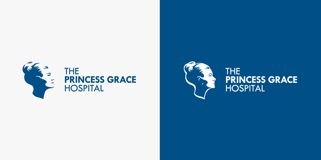
Well here it is in all its glory! The new Princess Grace Hospital Logo.
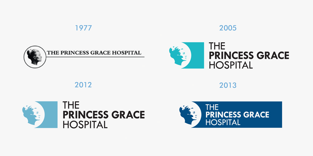
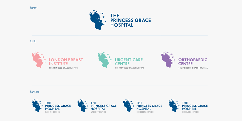
We started working with the hospital in 2013, beginning with a review of the brand and its touch points. The outcome of the review was to enhance the drawing of the hospitals logo, the head of Princess Grace, and establish a consistent and coherent sub-branding system.
From the very beginning we were careful to consider this as an evolution rather than a revolution of the brand. An enhancement that truly reflected the first class services and care of the hospital, and befitting of the Princesses beauty.
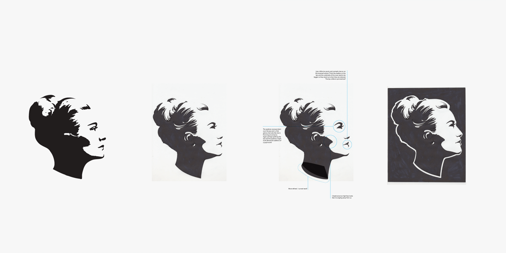
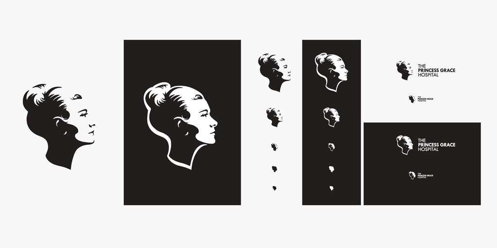
To operate in a modern environment, the brand needed to be adaptable. Ensuring the best reproduction in print and digital formats at sizes suitable for modern devices. To overcome this challenge we produced a beautifully detailed drawing of the head and an elegant silhouette, each with a specific use.
The resulting redraw is a timeless, elegant representation of Princess Grace and the hospital. A design that provokes a sense of well-being excellence across and a strong position for the development of the sub-branding system.
“Working with Atticus on re-drawing our logo and revitalising our brand has been a delight. Their collaborative and sensitive approach took the brief and turned it into a dynamic branding strategy, which has been hugely successful.”
Wouter Van den Brande, Consultant Liaison Manager, The Princes Grace Hospital.


