Art or Design?
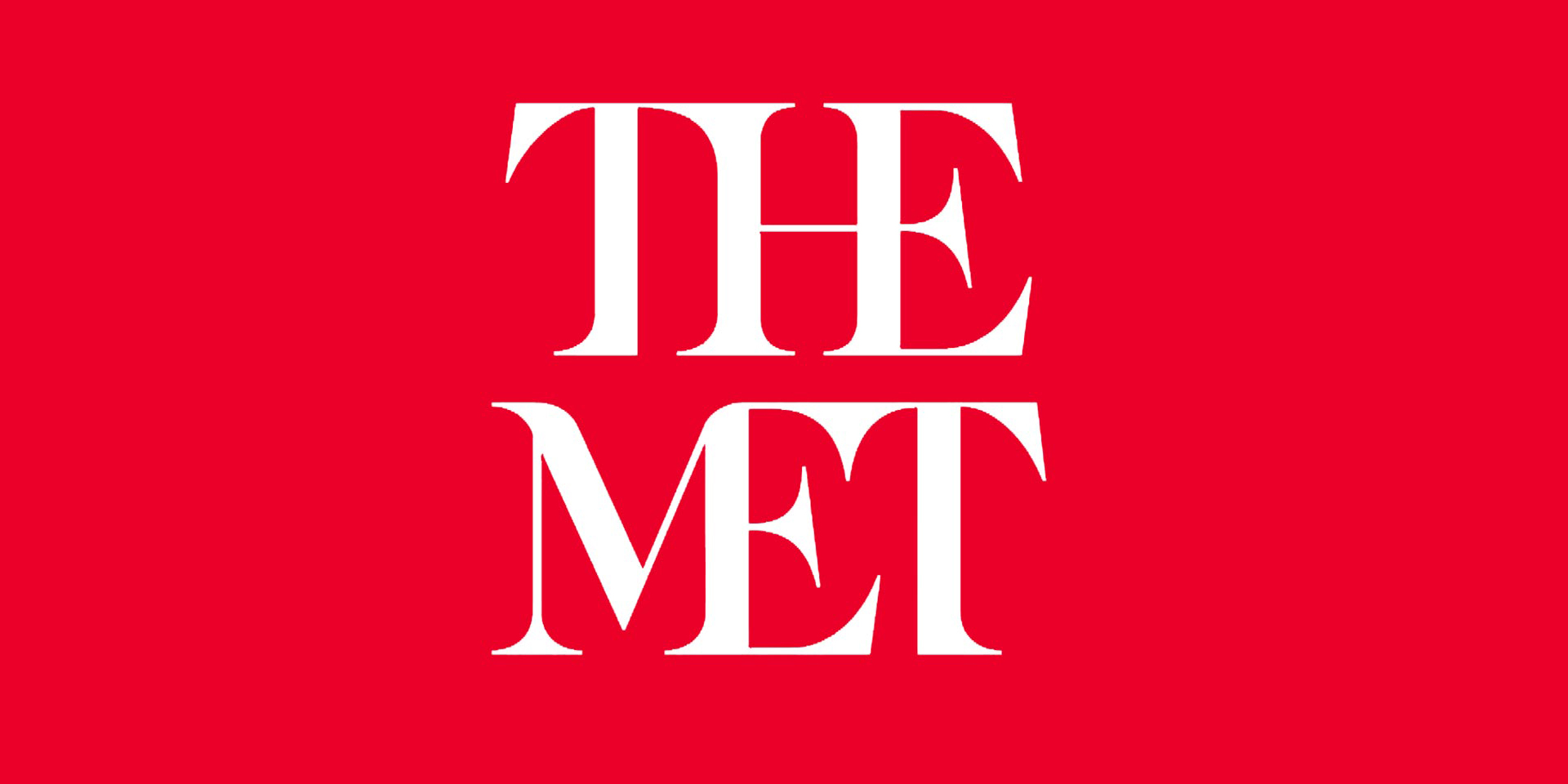
There’s quite a lot of bad press going round about The Met Museum’s new logo. Here’s my thoughts for what its worth. The ‘logo’ is part of the new brand, more of which can be seen here.
Herein lies the issue. Too often these days, people jump on the bandwagon of sledging creative without looking further into the overall context, or indeed reading about the rationale behind the work.
This casts my mind back to the creation of the current Fulham Football Club badge back in circa 2001. The club previously had not had its own badge and was using the local council logo. The new badge was launched on its own, out of context, on the club forum. It got a grave reception. “Progressive Germanic Graphic” and “It looks like a Swastika”.
Yet when the club struck it’s new kit deal with Puma and the badge was shown in context across the new kit and the new leisure wear range for the supporters, it was welcomed with open arms, and the club at last had some of its own IP to finally be proud of.
Good brands are not just designed for now, they are designed for the future. Think back to the 2012 Olympic branding. Again, launched to a hostile audience, 5 years ahead of its widespread use. Once the Olympics were upon us, was everyone out there buying a piece of Olympic merchandise, too right they were. Well, mascots aside.
Design fraternity – before you start sledging the work, take a bit more time to read into the thought behind the work. Take a look at the whole context of the piece, not just isolated items.
I for one think this is a stunning piece of work, that I hope, will down the line be regarded as a timeless piece.
Does the brand work according to wanting to create connections and be less isolating to a younger audience. Absolutely. If we are talking about just the logo, is balanced and typographically perfect? No, but then as a logo for a museum of art I can think of no better quote than one that was referenced by one of our team the other week – “Design has to work. Art does not” – Donald Judd.


